Timeline
SUR restaurant
Website Design
Strategy
Branding
Business problem
Many local restaurant websites only answer basic questions. But for a restaurant in a visitor-heavy area like Carmel/Monterey, the website needs to do more. It needs to help people decide quickly, especially when they are comparing multiple dining options on mobile.
My solution
I restructured the website around the real decision-making journey: first create appetite and trust, then make the menu easy to explore, then guide users toward booking, visiting, or hosting an event.
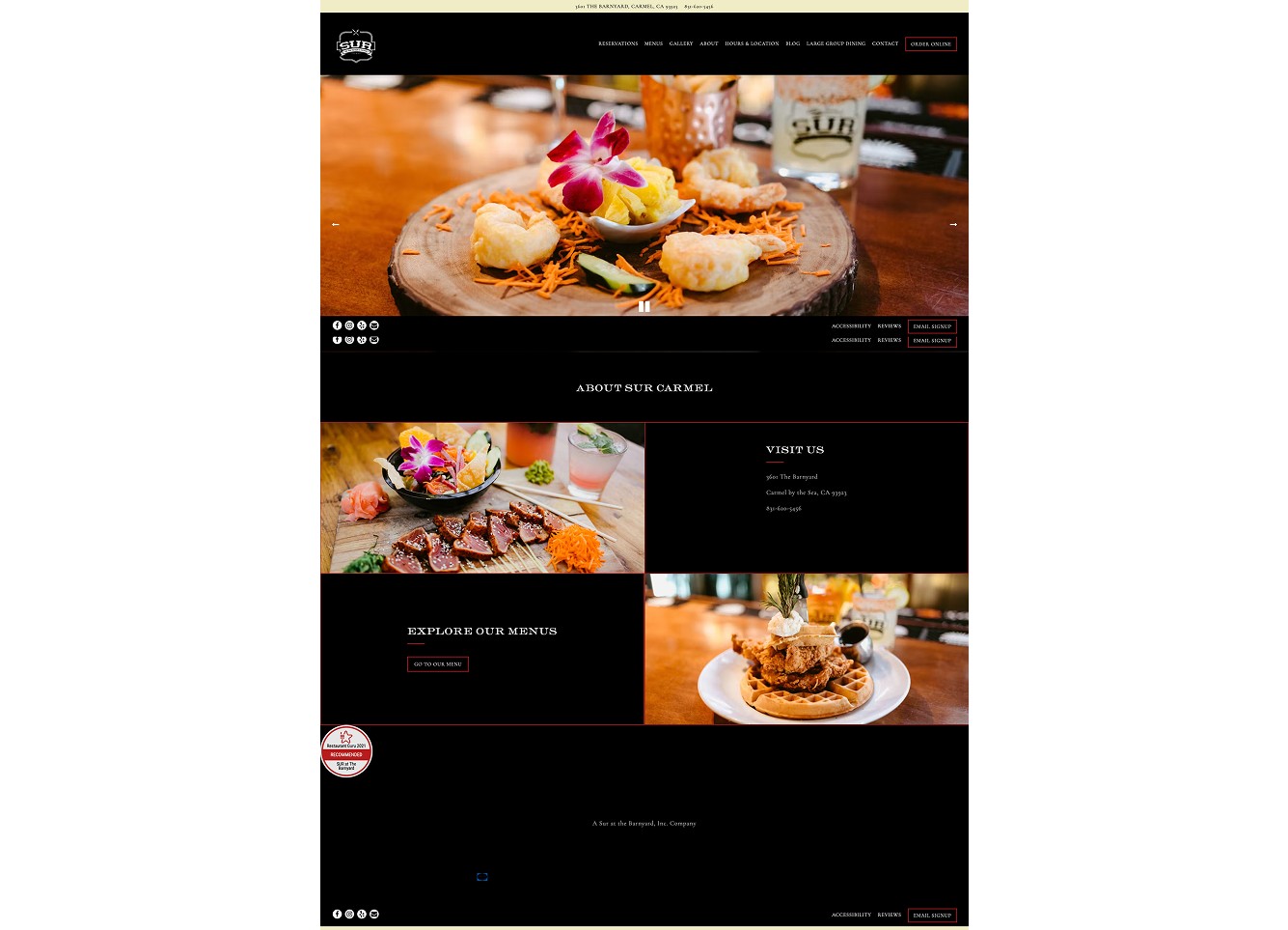
Before: Simple information page
Website felt more informational than persuasive.
Menu and restaurant personality were not strongly differentiated.
Key actions were not prioritized clearly.
After: Action-driven restaurant experience
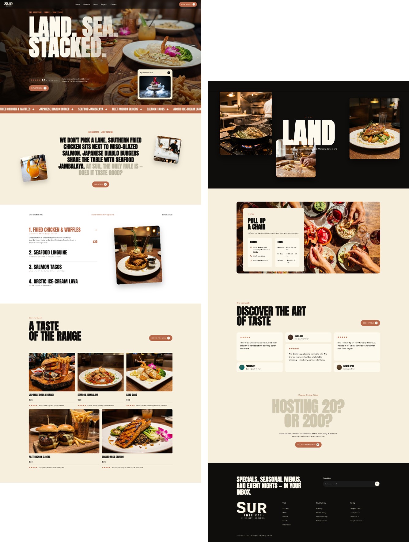
Stronger hero message with location, review proof, and immediate CTAs.
Menu highlights turned into visual “greatest hits” to help users decide faster.
Clear paths for reservations, full menu, location, catering, and newsletter.
A more memorable brand experience built around the restaurant’s “Land. Sea. Stacked.” concept.
Strategy — Turning Restaurant Discovery Into Action
Your strategy section should connect every design choice to a business goal.
Strategy 1: Lead with trust and appetite
The hero section combines location, review proof, emotional copy, and food-forward positioning. Instead of making users search for reasons to care, the page immediately communicates that Sur is established, loved, and worth exploring.
Examples from the current site:
“The Barnyard · Carmel · Since 2014”
“4.7 / 412 Google reviews”
“Book a Table”
“Explore Menu”
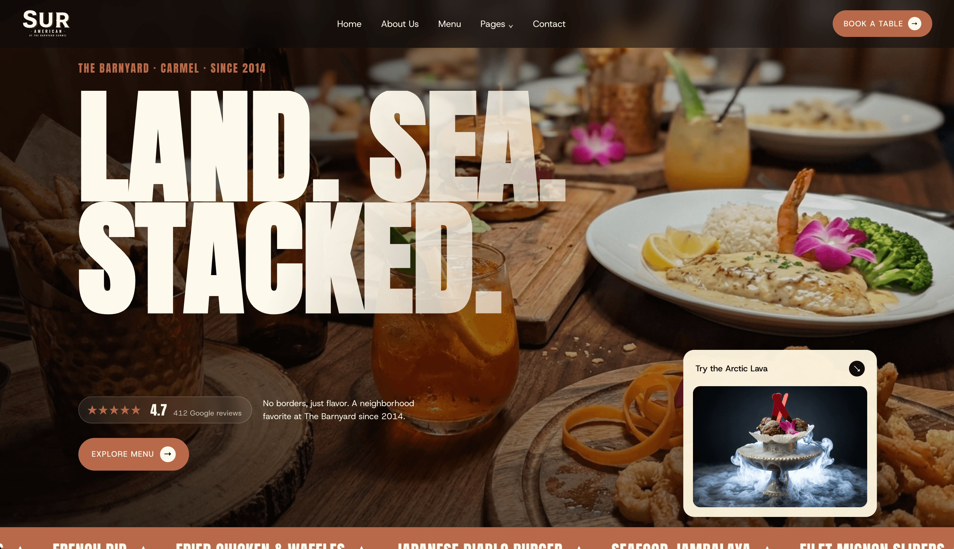
Strategy 2: Make the menu easier to understand
Instead of presenting the menu as a flat list, the website introduces signature dishes first. This helps visitors quickly understand what the restaurant is known for and gives them memorable items to anchor their decision.
This is especially important for a restaurant with a wide-ranging menu, because the design needs to make variety feel exciting rather than confusing.
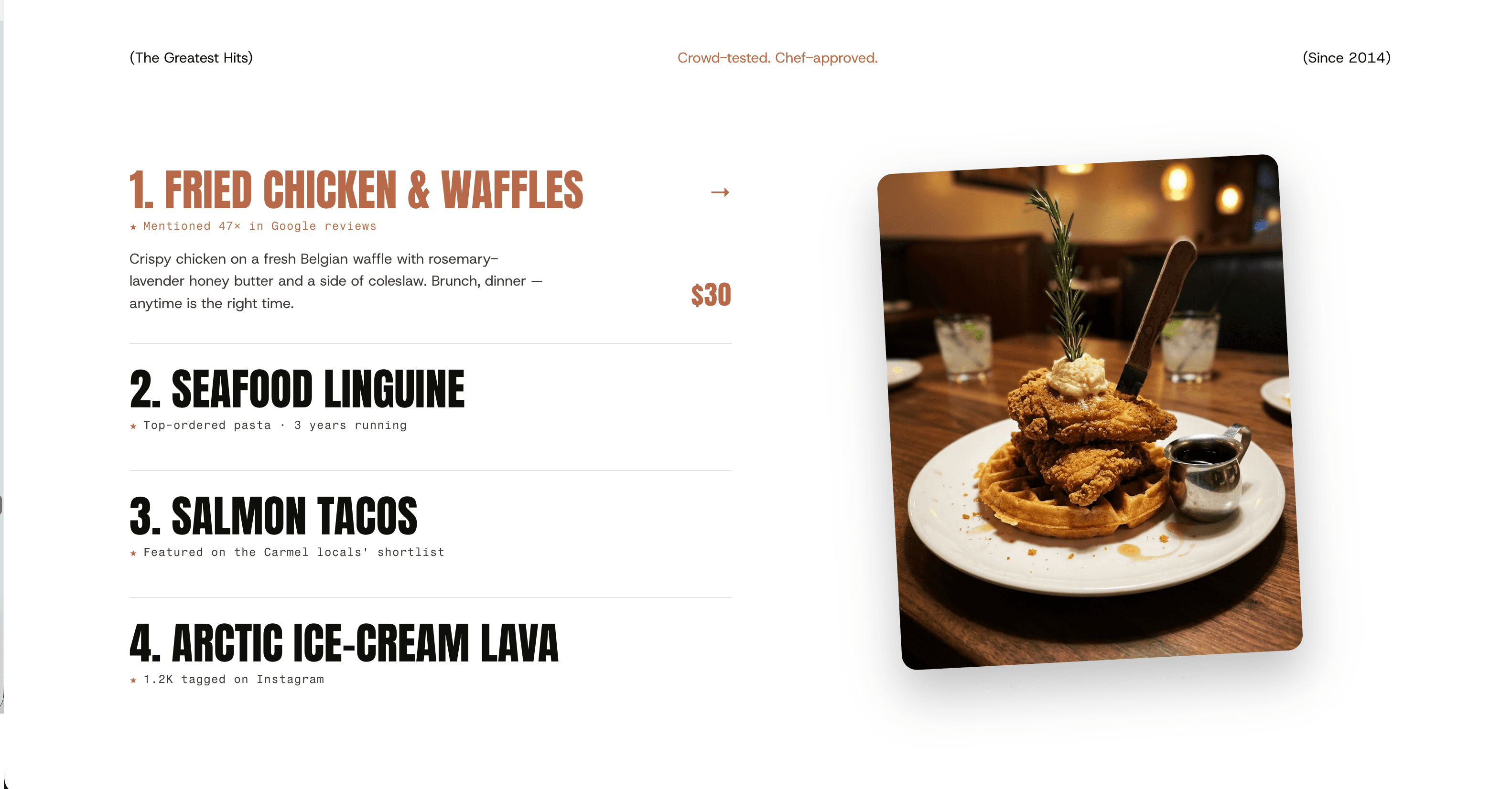
Strategy 3: Create multiple conversion paths
Not every visitor is ready to make the same decision. Some want to book a table, some want to browse the menu, some need the address, and some may be planning a private event.
User intent | Website action |
|---|---|
Ready to dine | Book a table |
Still deciding | Explore menu |
Planning a visit | Find address and hours |
Planning an event | Get catering quote |
Designed so the restaurant team can update it without waiting on a designer
Restaurant websites need frequent updates — from menu changes and seasonal specials to holiday hours, events, and catering details.
This website was designed to be easy for the restaurant team to maintain after launch. Instead of relying on a designer for every small change, the team can keep the site fresh and accurate on their own.
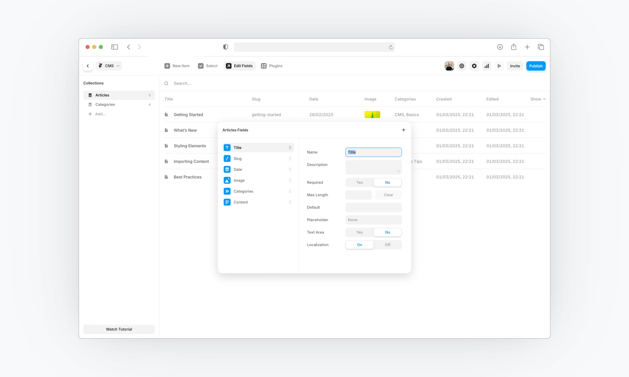
Easy to update
Menu items, descriptions, and prices
Seasonal specials and featured dishes
News, events, and holiday hours
Catering and private dining details
Testimonials, reviews, and homepage highlights
Why it matters
For restaurants, outdated information can quickly create confusion and lose customer trust. A flexible website gives the business more control, helps them respond faster, and keeps the online experience useful long after launch.