Timeline
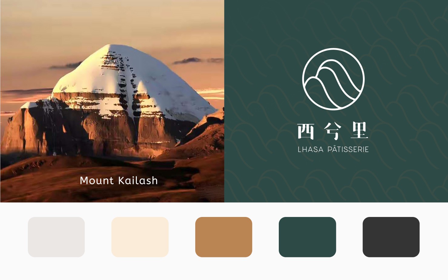
Lhasa Pâtisserie
Website Design
Strategy
Branding

The Challenge
Lhasa Pâtisserie needed a website that makes people want to visit our shop — and makes our $12 pastries feel worth it.
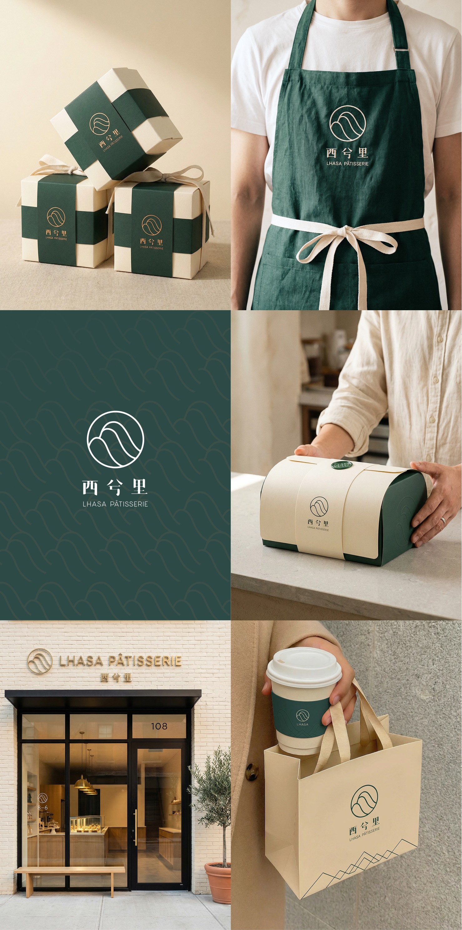
Brand Identity
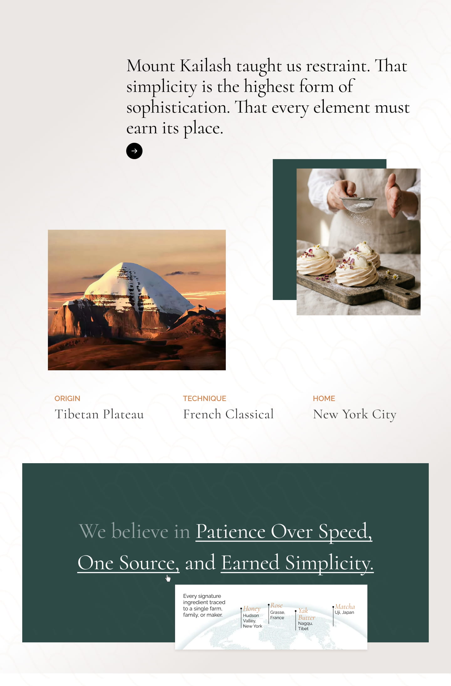
The logo combines a mountain motif — representing Mount Kailash, sacred peak of Tibet — with bilingual typography that bridges Eastern heritage and Western technique.
Website Design
The website tells the brand story through editorial layouts, generous white space, and ingredient-focused storytelling.
Section: Hero
The Challenge: First impression matters — show the craft immediately.
The Solution: Asymmetric layout with a process shot (hands piping) paired with the tagline. Shows artisanal quality before they read a word.

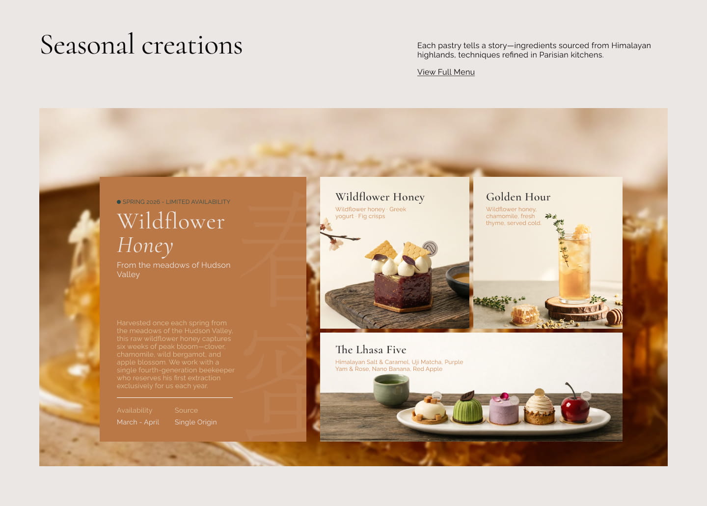
Section: Seasonal Menu Feature
The Challenge: Highlight limited-time items that drive repeat visits.
The Solution: Bento grid layout that tells the ingredient story — where the honey comes from, why it's special, and what pastries feature it.
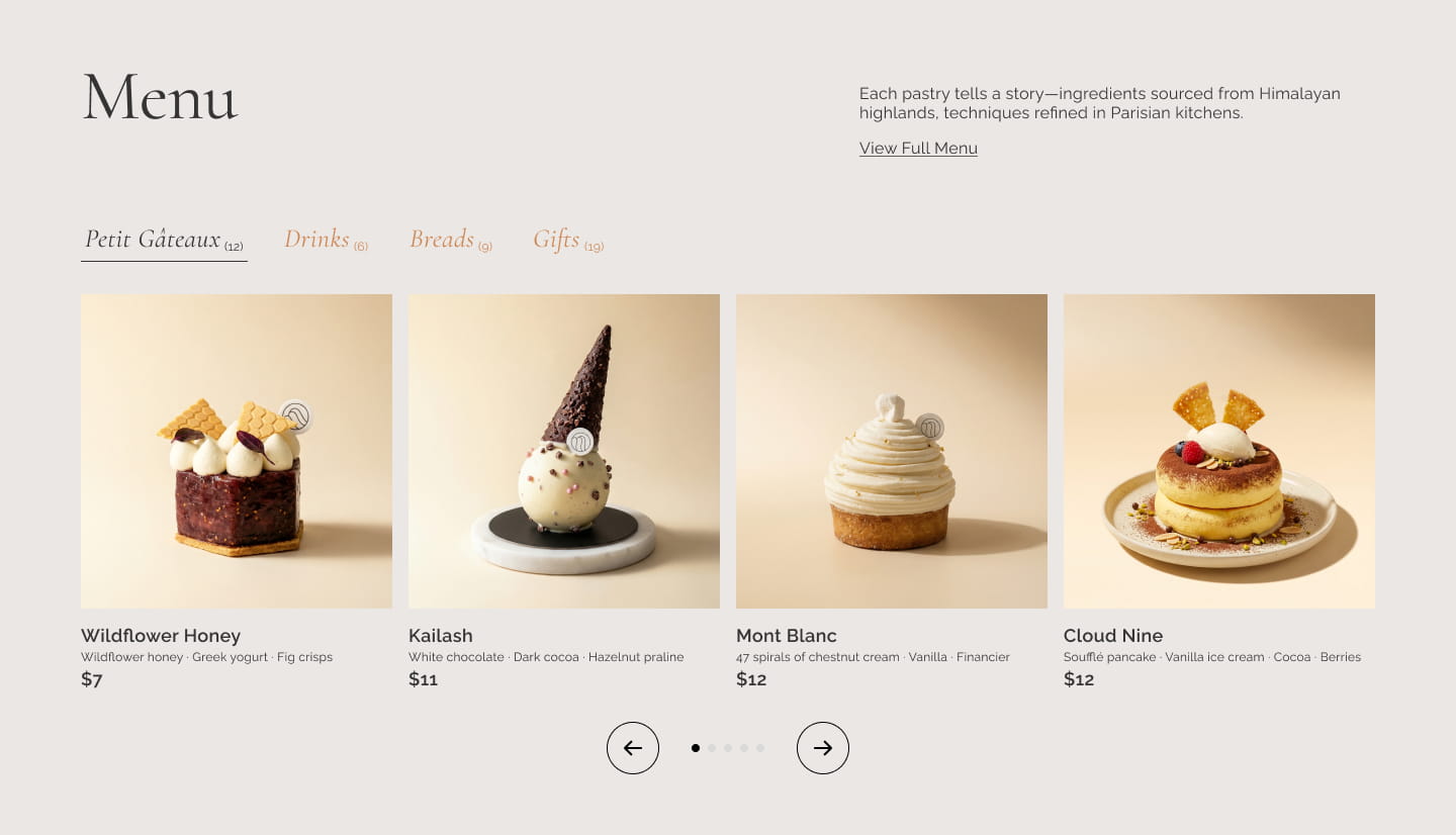
Section: Menu with Horizontal Scroll
The Challenge: 12+ pastries, 6 drinks, breads, gift boxes — without overwhelming visitors.
The Solution: Category tabs + horizontal scroll. Visitors browse one category at a time. Each card shows image, name, key ingredients, and price.
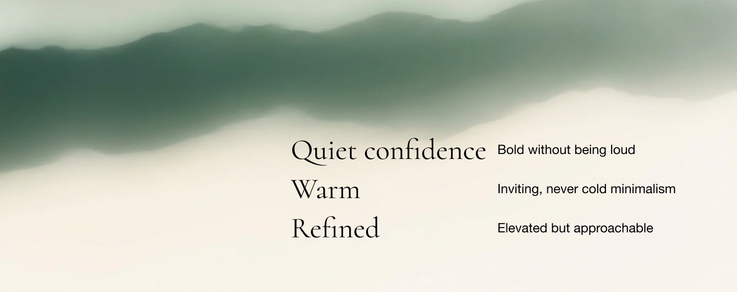
Section: Brand Principles
The Challenge: Communicate brand values without a wall of text.
The Solution: Hover-to-reveal interaction. Each principle expands to show its meaning — engaging without overwhelming.